


TYPOGRAPHY
Over the years I have designed many typographical solutions for various printed material predominately book covers. With typography it always presents a new and exciting challenge.
Below is a sample of some typographical solutions I have designed for various projects.
-Traditional hand drawing
- Adobe Photoshop
-Adobe Illustrator
-Adobe InDesign
TOOLS USED
ROLE
Graphic Designer
PROFESSIONAL PROJECTS

WARHAMMER
HORROR
The Resting Places was a new collection of Warhammer Horror stories written by several Black Library authors including David Annandale and Richard Strachan. Warhammer Horror is an exclusive sub-genre offering within the Black Library publishing house.
I was given the opportunity to do a full cover design for the collection that needed to be distinct but generic horror themed. All horror books in the Black Library offering have a red spot colour on the fore-edge and usually are designed in-house in a more graphical style.
Inspired by gothic, vampiric and dark magic themes, I wanted to play around with the titling to make the cover more typographical led rather than art-led. In the initial design stage, I was inspired to incorporate the typography into a spider’s web to give a creepy ‘stringy’ effect, giving the illusion that the title was suspended in mid-air. Once I developed this concept further and with feedback from the wider team, I took the vector base design into Adobe Photoshop and played around with shadows and brushes and digitally painted the webbing. The developed design resulted in two colour-ways which both were equally strong designs.
The final result is a bold, typographical, gothic horror cover which really stands out on the shelf when placed alongside other books.

PROJECT TYPE
-Book cover design
-Vector illustration
- Packaging design
ROLE
Graphic Designer
TOOLS USED
- Adobe Photoshop
- Adobe Illustrator
- Adobe InDesign
YEAR
2022
David Annandale | Richard Strachan | Jake Ozga | J. H. Archer Chris Thurston
THE RESTING PLACES


FINAL DESIGN

PROJECT TYPE
- Book cover design
- Typography design
TOOLS USED
- Adobe Photoshop
- Adobe Illustrator
- Adobe Indesign
The Warboss standard edition was to work alongside the mega edition which proved to be a hit with fans. The aim was to create a striking and edgy cover design that would compliment Tazio’s vibrant art style.
Predominantly using Adobe Photoshop, I created fractured typography that reflects the edgy, fun chaos that is classically Orks. I also designed the back texture and checkerboard texture for the spine as new assets to go in the general company domain that can be used for any Ork products going forward.
The result is a strikingly bold cover design with complimentary unique typography that is matches perfectly with the IP.
ROLE
Graphic Designer
2022
YEAR
AUTHOR
Mike Brooks
ARTIST - Cover Art
Tazio Bettin


FINAL DESIGN

WARBOSS

BLACK LIBRARY
BLACK LIBRARY
Grim Repast was a new Warhammer Crime novel written by Marc Collins, featuring the main character Quillion Drask. Warhammer Crime is an exclusive sub-genre offering within the Black Library publishing house.
Warhammer Crime books follow different branding design guidelines compared to the branding guidelines set out for the books in the standard range. With this in mind, the typography sits front and center of the cover and plays a prominent role in grabbing the reader’s attention. Through R&D, I wanted to go for a ‘sliced’ typography style to subtly imply the murderous grueling themes of the story without it being too obvious. I started by using Adobe Illustrator to create the typography vectors and composition, and then I developed the typography in Adobe Photoshop using a range of brushes and effects to get the subtle bloody look.
The landscape for the book is very dark, grungy but with a cold snowy theme. I designed two contrasting grunge snow textures in Adobe Photoshop as well as using another softer texture within the typography. Continuing the sliced theme on the back cover I broke outside of the grid in Adobe InDesign and worked with angles to right align the text and create the shards to feature the main character. The result is a bold, modern yet subtly strong book cover that compliments the art and story giving a bloody, haunting ominous vibe.

PROJECT TYPE
-Book cover design
-Typography
ROLE
Graphic Designer
TOOLS USED
- Adobe Photoshop
- Adobe Illustrator
- Adobe InDesign
YEAR
2022
GRIM REPAST
AUTHOR
Marc Collins
ARTIST - Cover Art
Amir Zand

FINAL DESIGN

Dynasty of Monsters was a new character-focused book featuring Lauka Vai. Written by David Annandale, Dynasty of monsters was to become one of the many new character-led stories for Games Workshop’s Age of Sigmar IP. The task was to design a full book cover design that led into Vampire themes but didn’t lean heavily into Warhammer Horror.
I wanted to create something special with the typography for this title, something that would be unique to the character and be distinctive. As this would go on to be one of the first of many character lead books, it was important that this title stood out on shop shelves and would grab customers attention. I took great inspiration from Igor’s artistic style and wanted to reflect abit of this in the titling and textures. Lauka Vai’s sword is a core part of the character, so it made sense to feature this in the design. For the book cover and spine, we decided to go with simpler typography due to legibility. However, the sword was used to feature in the Dynasty of Monsters limited edition art print featured in the 2021 Black Library Advent Calendar.
The final result is a bold, gothic cover with striking typography, which really stands out in the Age of Sigmar character series offering.
PROJECT TYPE
-Book cover design
-Vector illustration
- Typography
ROLE
Graphic Designer
TOOLS USED
- Adobe Photoshop
- Adobe Illustrator
- Adobe InDesign
YEAR
2022
DYNASTY OF MONSTERS
AUTHOR
David Annandale
ARTIST - Cover Art
Igor Kieryluk
BLACK LIBRARY


FINAL DESIGN

ADVENT CALENDAR ART PRINT

AHRIMAN ETERNAL
The Ahriman standard edition was to work alongside the mega edition which proved to be a hit with fans. The aim was to create an IP centric cover design that would compliment Dan’s art style.
Using Adobe Illustrator I designed the back frame of the book. Drawing inspiration from constellations, spell books and sorcerer aesthetic to help achieve the aesthetic of Ahriman who is a powerful sorcerer. Ahriman as a character is a well-established and much loved character within the 40K range already and had quite distinct IP relevant to him.
I chose to keep the same typeface as used in the mega edition to signify branding unity between the mega and standard edition that is uniquely Ahriman. Once I was happy with the vector composition of the back frame as well as the typography composition, I then added the glow effects using brushes and special effects in Adobe Photoshop.
During the design development process, the design had several colour options, however the final option was the gold frame and text on the red constellation texture background. The result is a classy, modern take on old-world magical aesthetic which gives a fresh look on Ahriman Eternal.
- Adobe Photoshop
- Adobe Illustrator
- Adobe Indesign
TOOLS USED
PROJECT TYPE
- Book cover design
- Typography design
ROLE
Graphic Designer
2022
YEAR
AUTHOR
John French
ARTIST - Cover Art
Dan Watson


FINAL DESIGN

PROJECT TYPE
TOOLS USED
- Adobe Photoshop
- Adobe Illustrator
- Adobe Indesign
ROLE
Graphic Designer
2022
YEAR
AUTHOR
Andy Clark
ARTIST - Cover Art

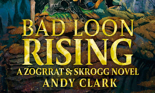
BAD LOON RISING
BLACK LIBRARY
Bad Loon Rising was the launch title for two new main characters Zograt and Skrog in Games Workshops fantasy range ‘Age of Sigmar’. These two new characters are unique to the Black Library publishing house which is Games Workshop’s book publisher. The aim of launching these two new characters was not only appeal to existing Gloomspite fans, but also recruit new people into the hobby via Black Library. So, the book needed to stand out on the shelf both front cover and spine to grab an audience’s attention.
In the initial design stage, I knew I wanted to create more of an illustrative back cover composition as I wanted to push myself out of the comfort zone and I knew that with this faction the premise of an illustrative back cover would work as the faction are abit wacky and do not conform to the norm. The Gloomspite faction are rich in IP and references which make them a particularly fun faction to design for.
Using Adobe Photoshop I sketched out some rough compositions of where text could be placed and hierarchy of elements. Then I digitally painted the moon and environment to build up the piece more. Through the design development stage, I refined the design to three final options based on feedback from the wider team.
The chosen design had the moon alone on the back cover and the simpler typography on the front. The result is a striking, bold and vibrant cover design that is perfectly suited to the IP and helps launch these two new exciting Black Library characters.
-Book cover design
-Vector illustration
- Digital painting
- Typography design
Henrik Rosenburg
FINAL DESIGN
