


CANAL & RIVER TRUST
Through plenty of research and getting under the skin of the new collection I started to play around with furs and textures and looking into how I could incorporate the ‘wild’ part into the branding; which would really set it apart from collections done previously. Incorporating the gold scratch and using different animal textures to signify the difference between products this was a subtle way of guiding the customer to certain products. Keeping the core text simple whilst creating powerful posters that can really set the line of cosmetics on the market.
An opportunity arose to design and create the branding for a new collection of cosmetics within Bobbi Brown cosmetics. For the new line named “The Wildcat collection”, I was tasked to create the full visual identity of this branding. This would be showcased in packaging, posters and a brochure of the new collection.
The result is a classic branding style which keeps the core branding colours of black and cream however with an edge by incorporating textures of other elements. Overall the result is a set of classic and edgy branding which is powerful in presence and sets itself apart from other collections previously done by Bobbi Brown cosmetics

PROJECT TYPE
- Architectural drawing
- Landscape design
- 3D Visuals/renders
ROLE
3D Designer/CAD Technician
TOOLS USED
- AutoCAD
- Google Sketch-up
- V-ray
- Adobe Photoshop
YEAR
2014-2015
HOUSEBOAT DEVELOPMENT


PEARSON INDOOR MARKET
The main novel of Interceptor City needed a new cover design as the existing cover for the novel was outdated and would not fit the aesthetic of the mega edition.
This was the only product within the mega edition that did not require to be designed as an 'in-world’ artefact. Black Library is well known for producing top quality collectors’ books and the brief for this was no exception. I wanted the design to highlight Interceptor City as a place and showcase the very best elements of aviation within the narrative. Materials wise, I chose to go with a grey leather vinyl and opted for silver blue metallic screen-print, showcasing small design details in the final vectored artwork.
The printed fore-edge was another design feature that added to the books premium feel. Indicating the ‘death drop’ of the aircraft on the side was unique to the narrative so naturally it lent itself to being on the fore-edge, making a statement on all sides.
Overall, the result and quality of the product exceeded expectations and really set itself apart from the design of the novella making it a highly desirable and unique collectable item.
FINAL DESIGN

NOTTINGHAM TRENT UNIVERSITY
During my time working for Black Library publishing house, I designed a variety of books in various formats including limited editions, paperbacks, royal hardbacks and series specials.
Below is a couple of samples of some of the limited editions that have been published and sold worldwide. All cover designs were illustrated by myself and the artwork is vectored using Adobe Illustrator for the purposes of print and manufacture. All book materials and chosen treatments where specified by myself, which I would then liaise with the supplier to get the best quality product and finish. Every detail from choosing the colour of the book ribbon, right through to the colour of tissue paper that the books would be encased in was carefully chosen and curated.

PROJECT TYPE
- Architectural drawing
- Landscape design
- 3D Visuals/renders
ROLE
Student
TOOLS USED
-AutoCAD
-Google Sketch-up
-V-Ray
-Adobe Photoshop
YEAR
2014
FINAL YEAR PROJECT
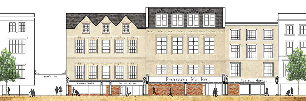
PEARSON INDOOR MARKET
The main novel of Interceptor City needed a new cover design as the existing cover for the novel was outdated and would not fit the aesthetic of the mega edition.
This was the only product within the mega edition that did not require to be designed as an 'in-world’ artefact. Black Library is well known for producing top quality collectors’ books and the brief for this was no exception. I wanted the design to highlight Interceptor City as a place and showcase the very best elements of aviation within the narrative. Materials wise, I chose to go with a grey leather vinyl and opted for silver blue metallic screen-print, showcasing small design details in the final vectored artwork.
The printed fore-edge was another design feature that added to the books premium feel. Indicating the ‘death drop’ of the aircraft on the side was unique to the narrative so naturally it lent itself to being on the fore-edge, making a statement on all sides.
Overall, the result and quality of the product exceeded expectations and really set itself apart from the design of the novella making it a highly desirable and unique collectable item.
COMMERCIAL SPACES
DINING & HOSPITALITY SPACES