GRAPHIC DESIGNER | ILLUSTRATOR
BLACK LIBRARY
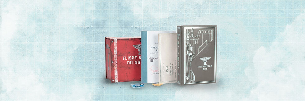
The ‘Interceptor City’ mega edition was 20 years in the making and was forecast to be one of the biggest earners for Black Library of that financial year. Dan Abnett, a much-loved author within the franchise, had already set a solid foundation for the narrative and subsequent IP, so the project held high expectations not only for Black Library but within the wider business of Games Workshop.
Appointed as the design lead for this project, I was responsible for designing and illustrating all elements for the mega edition which included two book cover designs, merchandise, illustrating an A3 map and designing the box packaging. Working with the art and editorial leads, I designed and developed all elements for the mega edition, keeping visual cohesion across the suite of products making it visually distinctive and unique.
Every part of the project was carefully thought out and planned, giving careful attention to detail ultimately leading to a top quality product that customers love.

PROJECT TYPE
- Product design
- Book cover design
-Vector illustration
- Packaging design
ROLE
Design lead / Graphic designer
TOOLS USED
- Adobe Photoshop
- Adobe Illustrator
- Adobe InDesign
YEAR
2024
INTERCEPTOR CITY


NOVEL
The main novel of Interceptor City needed a new cover design as the existing cover for the novel was outdated and would not fit the aesthetic of the mega edition.
This was the only product within the mega edition that did not require to be designed as an 'in-world’ artefact. Black Library is well known for producing top quality collectors’ books and the brief for this was no exception. I wanted the design to highlight Interceptor City as a place and showcase the very best elements of aviation within the narrative. Materials wise, I chose to go with a grey leather vinyl and opted for silver blue metallic screen-print, showcasing small design details in the final vectored artwork.
The printed fore-edge was another design feature that added to the books premium feel. Indicating the ‘death drop’ of the aircraft on the side was unique to the narrative so naturally it lent itself to being on the fore-edge, making a statement on all sides.
Overall, the result and quality of the product exceeded expectations and really set itself apart from the design of the novella making it a highly desirable and unique collectable item.


NOVELLA
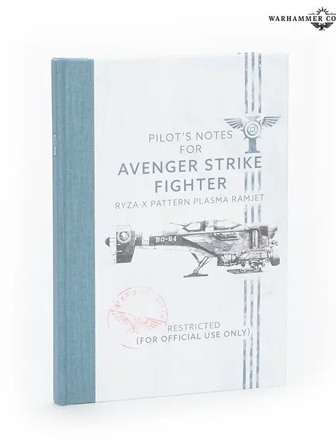
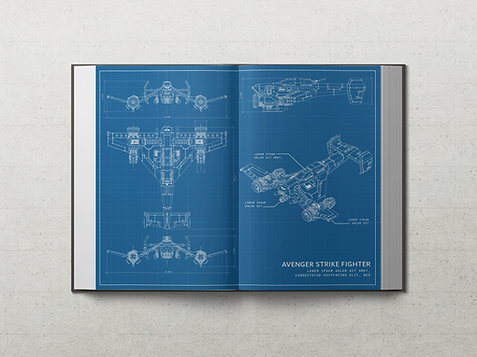
As part of the suite of products in the Mega edition an additional ‘reference book’ was commissioned to represent an in-world artefact and be the pilot’s logbook that is found inside the ‘black box’ helping to enrich the overall suite of products.
This book needed to work in harmony with the main novel but really represent what a 40K in-world pilots’ logbook would look like. There was already a specification written for the book and initial materials chosen. I kept the tapered spine and changed the choice of cloth but developed the choice of treatments and the overall aesthetic of the book. This included the design of the internals and the endpapers to help the reader feel like they are reading an in-world artefact. Special features include the use of plane schematics on the endpapers and a distressed grid texture on chapter starts and signing sheet.


MERCHANDISE
The exclusive Interceptor City merchandise, features an intricately illustrated A3 map, a striking metal pin badge and a detailed embroidered cloth patch. Each item is designed to help enrich the narrative of the story, reflecting the unique artefact's that would typically be found within an Interceptor City plane wreckage.
I illustrated the map based on the author’s notes and was inspired by World War II references which serves as a captivating guide to the world of Interceptor City. These additional collectable items helps to celebrate and immerse the reader deep within the narrative adding to the premium quality and feel of the mega edition.


MAP ILLUSTRATION
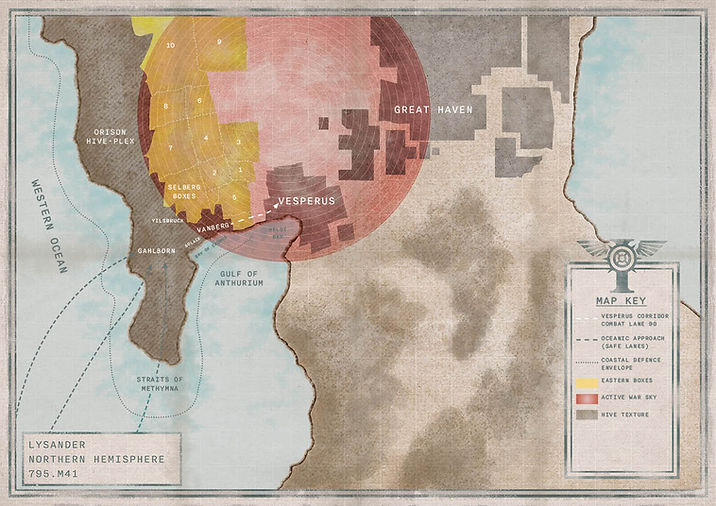
I loved creating this map as it gave me the opportunity to lean into my illustration skills and it was a fantastic creative challenge as I needed to blend accuracy of the content (based on the authors notes), whilst keeping the visual aesthetic that matches with the rest of the mega edition. I referenced old flight maps to help achieve visual accuracy, taking key features that helps make these maps distinctive in comparison to other maps such as ordinance or survey maps. One of the features I incorporated was painting of ‘fold lines’, creating a distressed aesthetic but also providing a practicality by guiding the user of where to fold the map.
I kept the colour palette muted in tone as I wanted it to seem like a vintage travel map uncovered from years of use. When I was digitally painting the map, I used a mixture of textured brushes that I had created in Photoshop to give it a unique blend of soft texture and tone.

CLOTH PATCH
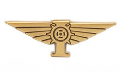
PIN BADGE


Due to its size, the scope for lots of detail in the design was minimal due to manufacturing processes. The pin badge was always intended to emulate a ‘pilots wings’ badge so any pilot within Interceptor City would have one of these badges. After a handful of initial designs, the simplest design using the imperial icon set against the wings was the best choice going forward. With a brushed brass effect, the pin badge is smart and classy edition to the suite of products in the mega.
The initial designs for the fabric patch started off as different shapes but keeping to the same overall size specified to the supplier. Referencing WW2 cloth patches I knew the rough colour palette and style, the design choice to go with a cool colour palette rather than army green was due to conflicting with another IP within the business. As the design developed, the overall composition of the design was to keep to ‘Circus 66’ at the top and the main focus be on the aircraft travelling down with an abstract backdrop of the ‘Hive City’ in the background.
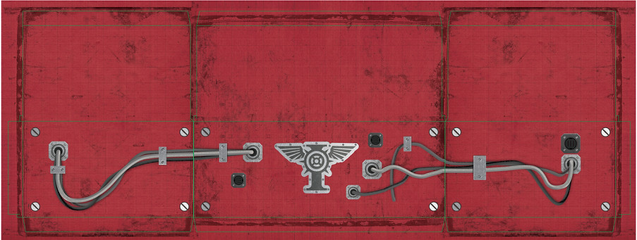
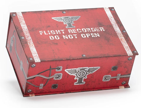
BOX PACKAGING
The intention for the box packaging was for it to look like a ‘black box’ discovered from a plane wreckage. There was no visual precedent for what a 40K black box would look like so aesthetically this was new territory.
Using the combination of flight black boxes, WW2 memorabilia and direction from the art lead, I began by mocking up initial designs; keeping in mind key features usually found on black boxes such as a handle and warning text. The box packaging needed to reflect the ‘in-world artefact’ aesthetic whilst remaining accurate to the IP and I wanted the customer experience to be exciting and engaging. This was my main influence for incorporating a ‘control panel’ at the bottom of the box with cracked screens, cables and switches giving an extra sense of intrigue to the product.
The cables on the outside of the box where mainly influenced by core 40K IP markers, as the initial designs were looking too clean and polished for the genre. I wanted the cables and plug details to continue seamlessly around the box, making it look more visually cohesive. Most black boxes are either bright red or orange in colour, so I wanted to keep the red colour but add lots of texture to really give the box a battered and weathered look. Even though this packaging was a challenge at times, I thoroughly enjoyed designing it and making something entirely unique to the 40K product offer.

PACKAGING NETS