GRAPHIC DESIGNER | ILLUSTRATOR
WARHAMMER
HORROR
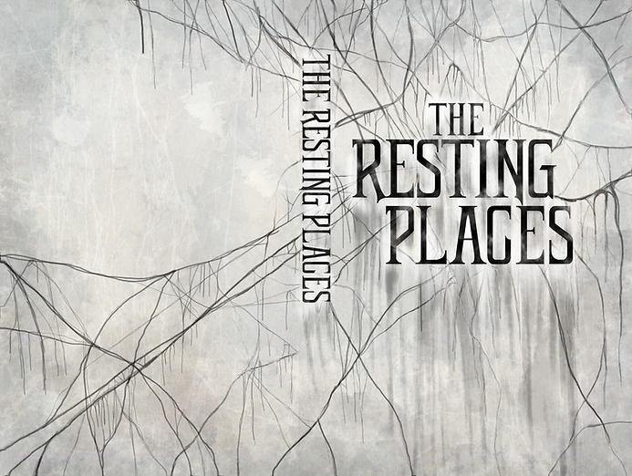
The Resting Places was a new collection of Warhammer Horror stories written by several Black Library authors including David Annandale and Richard Strachan. Warhammer Horror is an exclusive sub-genre offering within the Black Library publishing house.
I was given the opportunity to do a full cover design for the collection that needed to be distinct but generic horror themed. All horror books in the Black Library offering have a red spot colour on the fore-edge and usually are designed in-house in a more graphical style.
Inspired by gothic, vampiric and dark magic themes, I wanted to play around with the titling to make the cover more typographical led rather than art-led. In the initial design stage, I was inspired to incorporate the typography into a spider’s web to give a creepy ‘stringy’ effect, giving the illusion that the title was suspended in mid-air. Once I developed this concept further and with feedback from the wider team, I took the vector base design into Adobe Photoshop and played around with shadows and brushes and digitally painted the webbing. The developed design resulted in two colour-ways which both were equally strong designs.
The final result is a bold, typographical, gothic horror cover which really stands out on the shelf when placed alongside other books.

PROJECT TYPE
-Book cover design
-Vector illustration
- Packaging design
ROLE
Graphic Designer
TOOLS USED
- Adobe Photoshop
- Adobe Illustrator
- Adobe InDesign
YEAR
2022
THE RESTING PLACES
AUTHORS
David Annandale | Richard Strachan | Jake Ozga | J. H. Archer Chris Thurston


FINAL DESIGN


RESEARCH & DEVELOPMENT
INITIAL SKETCHES


I was first inspired by ‘ethereal’ gothic
aesthetic which I wanted to incorporate
in the typography. Trying to create a
haunting, ethereal aesthetic.
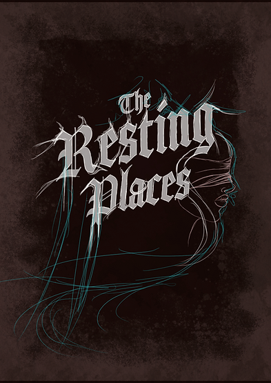
Developing the design, I reverted to a more traditional black-letter font with a simpler typography hierarchy. As much as I wanted to incorporate the illustrations of the veiled figure it was not fitting the brief well.


Playing around with ‘bleeding’ typography
mainly drawing inspiration from heavy
metal style typography.

Inspired by blackletter typography, playing with hierarchy, and using illustrative elements to tie the piece together.
DESIGN DEVELOPMENT

I was inspired by the idea of the typography being suspended by spiders webbing and that this webbing would be the element that holds all typography across the cover
including the spine.

Due to the texture of the webbing, I opted for a more
modern but gothic style font. The rest of the cover
was digitally drawn and developed using Adobe
Photoshop.
FINAL DESIGNS